Overview
The San Diego Circuit is a specialized service designed to facilitate inter-library book borrowing among users across participating libraries within the San Diego Circuit network as well as sharing information among the community. This stream-lined process enables patrons to efficiently access books from alternate Circuit libraries when the desired titles are unavailable at their home library.
For this project I was tasked to rebrand the San Diego Circuit, primarily redesign the logo and include collateral pieces like flyers and pins.
Research
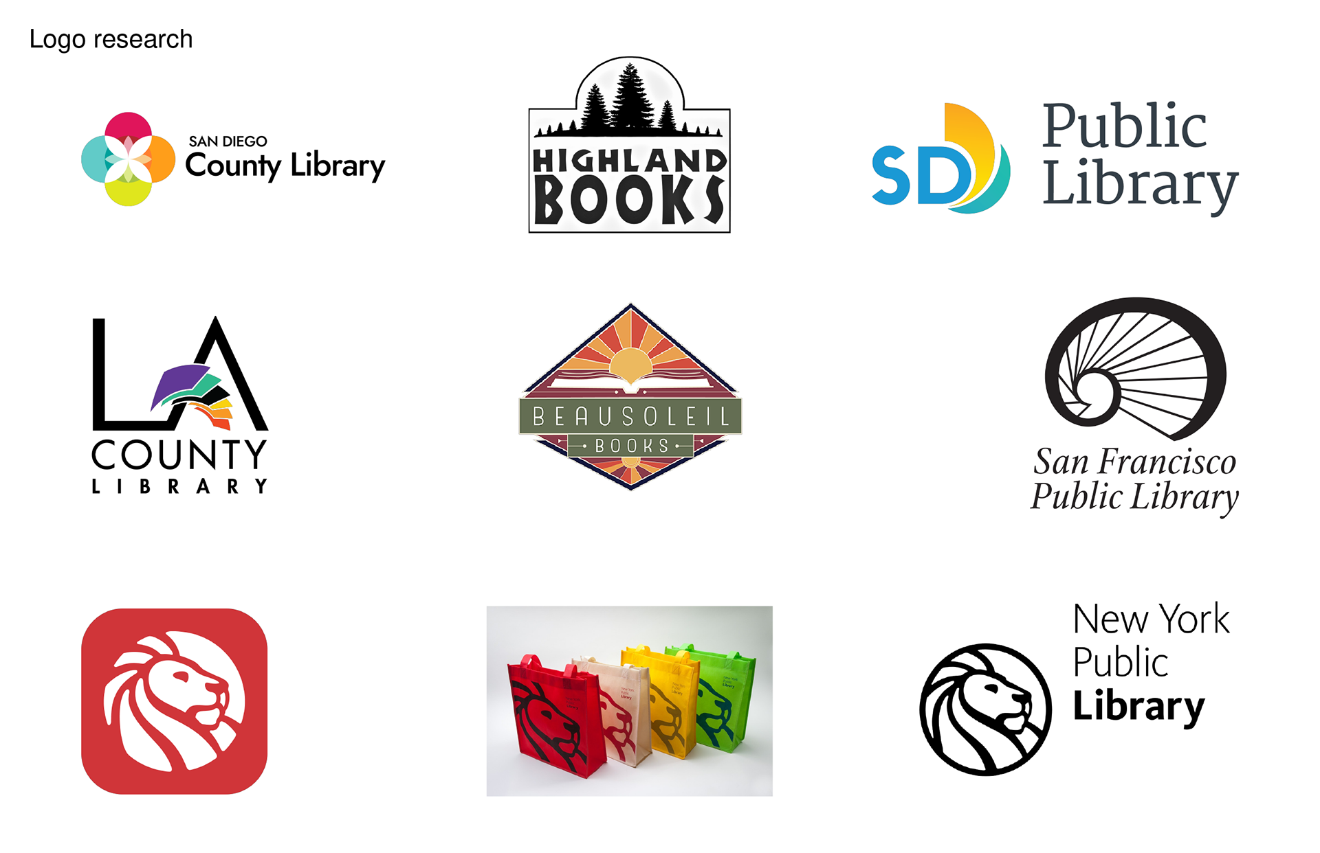
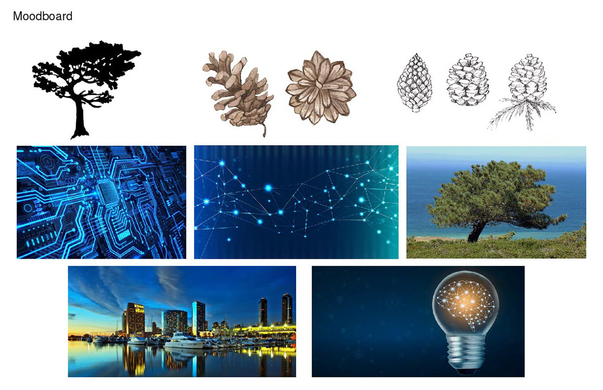
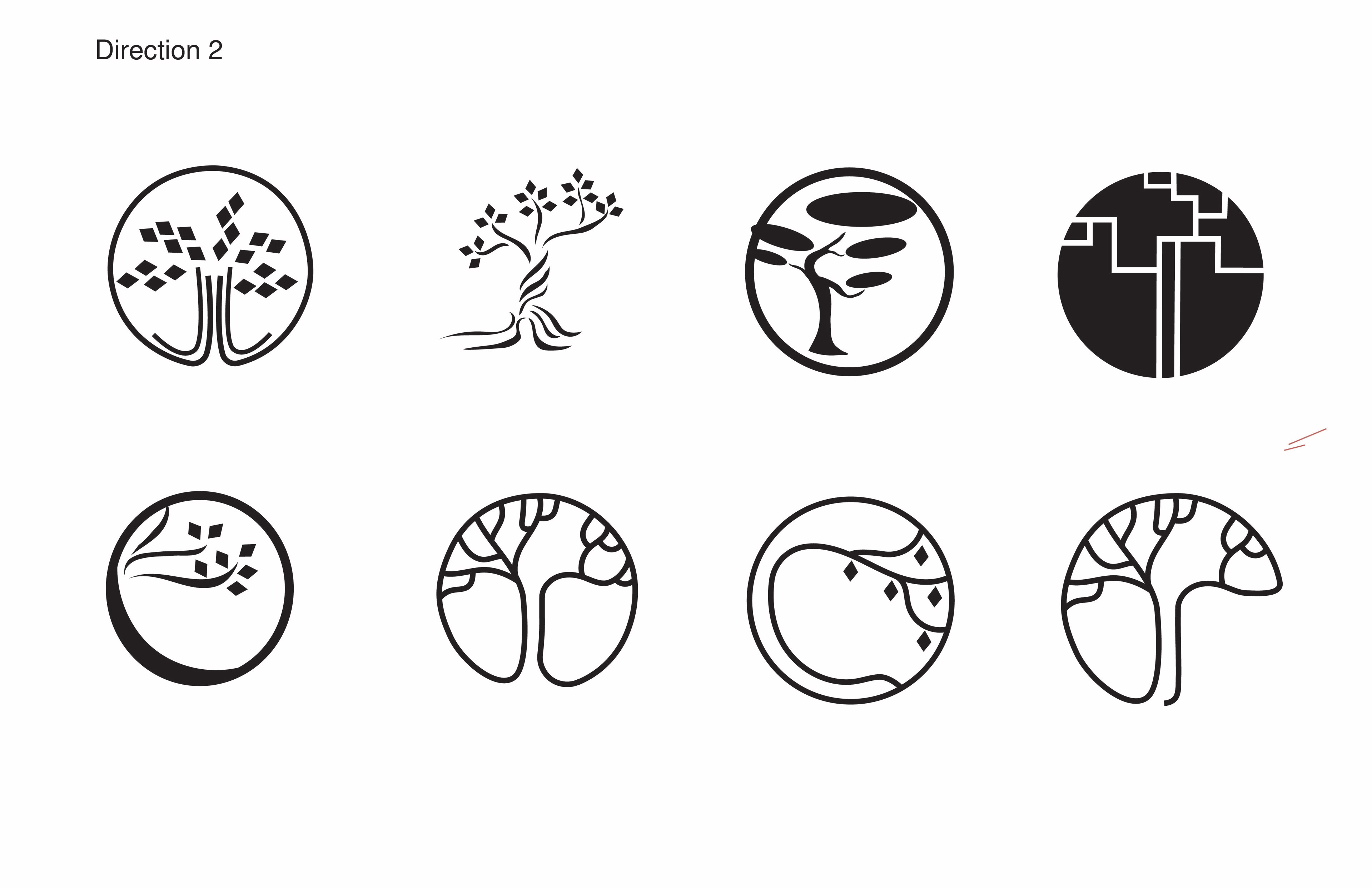
The brands core values are sharing knowledge and connecting the community, as well as reflecting the uniqueness of San Diego where the brand is based. Upon my extensive research I found out that Torrey pines are actually a very rare species and only grow primarily in San Diego and partially in Santa Barbara counties. I decided to use this information as my foundation for the logo mark.
Process

Final Logo Brand Sheet and Applications
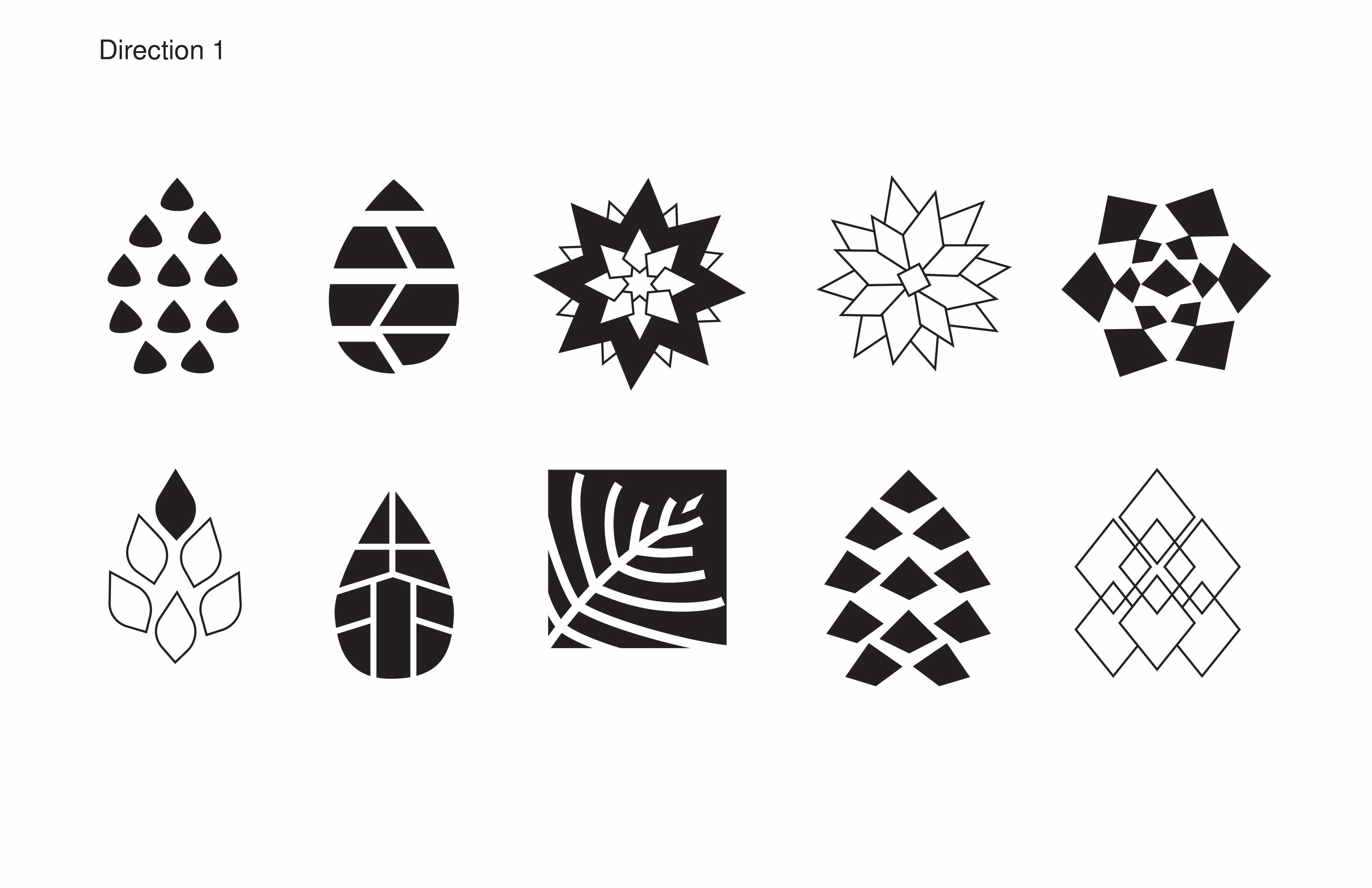
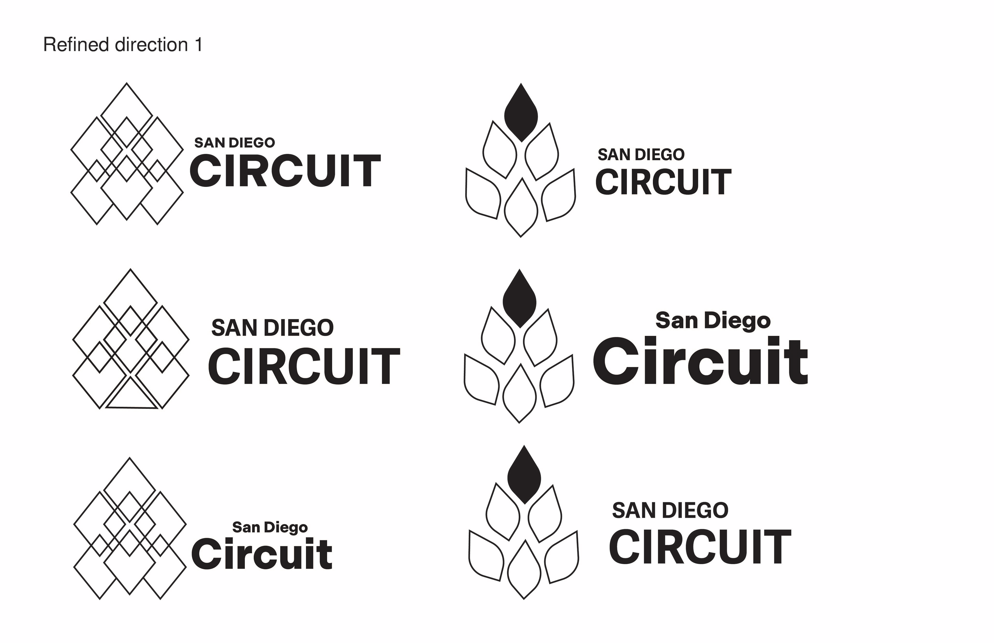
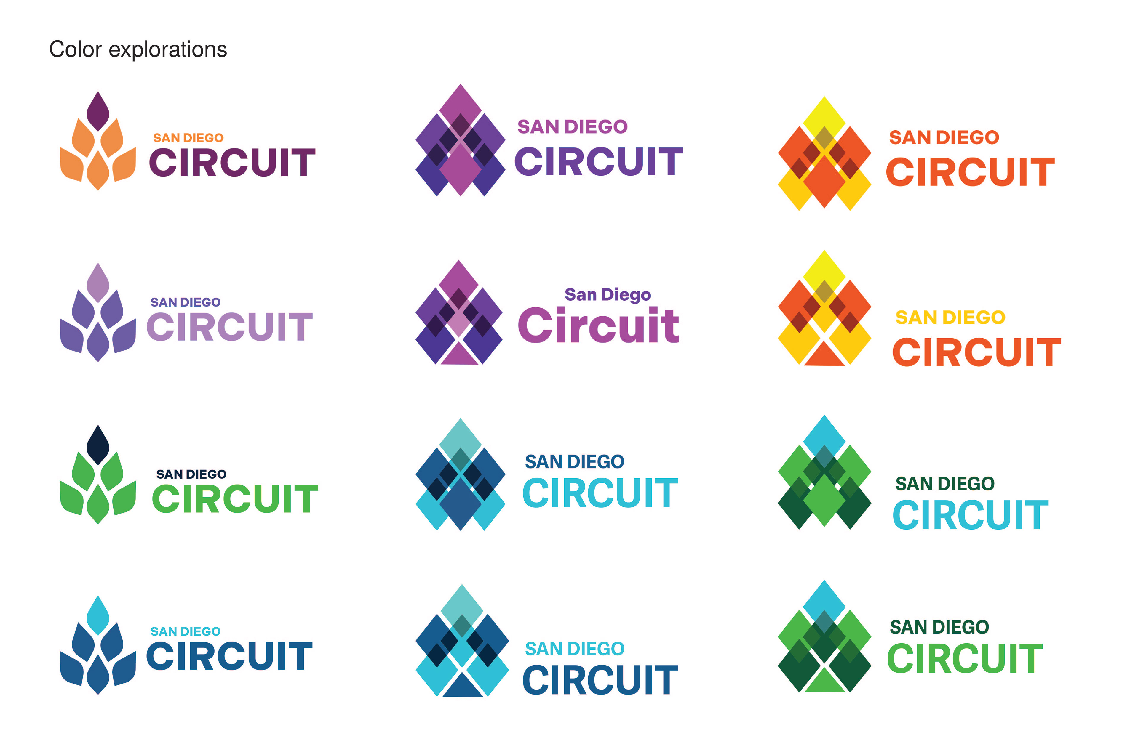
The final logo mark is inspired by Torrey pine cone. The bigger diamonds represent different communities coming all together in one diamond on top, which is circuit. The smaller diamonds appearing from intersections represent the 5 libraries connected to the circuit. The geometric and sharp feel of the logo reflects the function of the brand, which is a web based service. Blue dominates the color palette reflecting professionalism, trust and connectivity. The different shades help to create depth and visual interest. For the logotype I chose a modern san-serif font to go well with the logo mark. The colors are drawn from the mark and Circuit is highlighted with the color it represents on the logo. The patterns are the modified logo repeated and rearranged in several ways.
